


![]() Tue Mar 21, 2017 10:38 pm
Tue Mar 21, 2017 10:38 pm
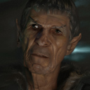
Re: EB Verve Painter
thanks Taron, u trully have an artistic eye,
hope this all will ends well, for me, for my people, has been a long way, and there is still a long way to go. thanks again.
hope this all will ends well, for me, for my people, has been a long way, and there is still a long way to go. thanks again.
Facebook: https://www.facebook.com/gonnabdh
Portfolio: https://www.deviantart.com/eduardobedoya/gallery
System: Intel Core i7-13700K, NVIDIA GeForce RTX 4080 16GB, CORSAIR Vengeance DDR5 32GB, Windows 11
Verve Wishlist:
-LSH color pallete
-Brightness Knob
Portfolio: https://www.deviantart.com/eduardobedoya/gallery
System: Intel Core i7-13700K, NVIDIA GeForce RTX 4080 16GB, CORSAIR Vengeance DDR5 32GB, Windows 11
Verve Wishlist:
-LSH color pallete
-Brightness Knob


