DrPetter scribbles


Showcase your Verve Art to all ages!
Image

Forum rules
Only post Jpeg images less that 256kb in size, or post a link instead! Keep it family friendly here, please!

Posts: 32

Joined: Sun Nov 10, 2013 8:22 pm

Post Sun Jan 12, 2014 4:03 pm

Re: DrPetter scribbles

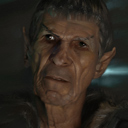
Bah, ended up pulling bump down to zero after a while since I couldn't really paint with any decent opacity without blobbing things up. Cheating, I know. At least the hair and lips used some 3D. Needed layer structure to allow that. As is often the case, I ended up twisting the whole head into a slightly different angle than the photo I was painting from, so that led to all sorts of dilemmas about how to resolve relative proportions. I was also super-chicken about value range for the skin.

Again, not a great use for this specific application since I was basically fighting its features to get smoother brush strokes. Also I never really ended up zooming or doing other convenient things, for some reason. I guess I was scared to start pressing unfamiliar buttons, but the whole app seemed very stable and reliable throughout so that's good! Well, apart from not having more than one level of undo, that is.
Attachments
fredenham.jpg
fredenham.jpg (78.93 KiB) Viewed 82882 times
User avatar

Site Admin

Posts: 7278

Joined: Sun Nov 10, 2013 1:38 pm

Post Sun Jan 12, 2014 6:15 pm

Re: DrPetter scribbles

Heya, now that works quite well!

Bump on zero is not cheating, hahahaha, OMG. If anything, having bump could be considered cheating by some. But I like it. However, I still don't like the way I keep building up bump with the brushes. I should figure out an elegant way of letting it settle like a puddle of paint would. I'll keep my head on that topic for a while, I think, because it's really kind of annoying.

It's surprising, now that you mention it, how little trouble I'm having with just one undo (per layer, at least!). Odd thing, I could most certainly add countless undos, if I felt like it...or rather, wasn't scared where to put it, because at some point gfx-memory might fill up - OR I forget about it and by the time I manage to go to higher resolutions this will nib me in the butt.

Back to you, what I always admire about your sketches is that you seem to have a certain feel for achieving a lot with a few well placed strokes. I noticed that on much earlier canvarion scribbles of yours. If you had nerves for it, you could really bring the best out of Verve with that skill.

TIP: Fill your canvas with a color. Crank Fluid-smudge to 99% or so and flatten the canvas down (hold shift and smudge around). From that moment on, paint with around 60% opacity and you should be able to deal with the bump quite well. Taking it down to 20% or less is actually most natural. In some ways the bump height simulates the real life scale of the painting (logically speaking).

TIP 02: Work consciously with the fluid-smudge amounts! Consider the effects of Fluidity, too, because it's often worth to adjust it to your desires! Remember the pen pressure minimum size, too, which can be very powerful, if you use pen pressure!

TIP 03: You can crank Fluidity up high and turn your opacity to zero to just float paint around (not using Shift). Adjust the remaining fluid parameter to your needs. I often turn fluid-sharpness all the way to 100% and fluid smudge to 90%-100% for some curious whisps, for example. But even at gentle, precise strokes high fluidity can be extremely powerful and feel fantastic! small brush size...ah...curious stuff, very surreal/novel!

Again, great job, though! Considering that you're using only few features of Verve, this is indeed impressive! :D
Here to help! :D
System Info: AMD Radeon RX Vega 10, AMD Ryzen 7 (2.3 Ghz), Windows 11
Taron.de | Twitter | Pinterest | YouTube

Posts: 32

Joined: Sun Nov 10, 2013 8:22 pm

Post Sun Jan 26, 2014 6:49 pm

Re: DrPetter scribbles

Finally got to play around a bit with the scribble+average routine. I decided to go easy on myself with a basic profile view. Sorry, no perspective grid yet!

It's fun to just let the patterns grow by themselves as you add splotches here and there. Gets a bit divorced from any underlying anatomy sometimes, perhaps, but it does tend to get a gritty "detailed" and deliberate look very quickly. All the directed strokes working together to build a shaded region out of some scratchmarks and a vague idea.

I got too carried away with the background stuff, for sure. Wanted to make a sort of compositional splash going across him cut behind the head, but it's too distracting I think... Also the weird bumpy stuff at the bottom was totally an accident that I liked enough to keep, even if it makes no sense at all!

For some reason I really like the tiny thumbnail Windows made for this image, so I'm attaching that too.
Attachments
turtle-thumbnail.jpg
turtle-thumbnail.jpg (9.52 KiB) Viewed 82872 times
turtle.jpg
turtle.jpg (167.88 KiB) Viewed 82872 times
User avatar

Site Admin

Posts: 7278

Joined: Sun Nov 10, 2013 1:38 pm

Post Sun Jan 26, 2014 6:59 pm

Re: DrPetter scribbles

No doubt; you are an artist. With what you do, you show that you have the certain something one can't train to have. At the same time you train yourself with every sketch to become even more concrete, more in charge of what you do. But even now it already has everything it needs to have to be something enjoyable to see again many years from now.
Damned, there's not one smily that brings across the properly respectful joy I'd want to attach. :) (nope, not that one) :shock: (this one neither) :geek: (nope) :mrgreen: (hell no)...I'm giving up! :roll:

Awesome painting!
Here to help! :D
System Info: AMD Radeon RX Vega 10, AMD Ryzen 7 (2.3 Ghz), Windows 11
Taron.de | Twitter | Pinterest | YouTube

Posts: 32

Joined: Sun Nov 10, 2013 8:22 pm

Post Sun Jan 26, 2014 10:23 pm

Re: DrPetter scribbles

Uh... some really weird and unconventional Batman scribbles. Just trying to randomly goof around with various properties. Most of them were rather stiff and boring, but then I gradually loosened up going down and right over the page. Some day I gotta keep continuing past that point where it starts flowing a little bit. This time I just wrapped it up by coloring in the last picture and getting increasingly confused about various portions of it. I think it still has some nice vibes, even though shoulders are mysteriously turning into biceps and who knows what else...
Attachments
batmen.jpg
batmen.jpg (127.68 KiB) Viewed 82871 times
batmancolor.jpg
batmancolor.jpg (39.99 KiB) Viewed 82871 times
User avatar

Site Admin

Posts: 7278

Joined: Sun Nov 10, 2013 1:38 pm

Post Mon Jan 27, 2014 1:42 pm

Re: DrPetter scribbles

Heehehe, yeah, the anatomy is quite random, but the overall feel is interesting. I like the bizarre proportions. I've done so many muscle studies by now, I should be an expert, but even I have to refresh from time to time again. So, yeah, it's no shame to check out some bodybuilding pictures or anatomical studies.
Here to help! :D
System Info: AMD Radeon RX Vega 10, AMD Ryzen 7 (2.3 Ghz), Windows 11
Taron.de | Twitter | Pinterest | YouTube

Posts: 32

Joined: Sun Nov 10, 2013 8:22 pm

Post Mon Jan 27, 2014 2:18 pm

Re: DrPetter scribbles

Thanks. Yeah, I should try another doodlefest like that later, but concentrate on redrawing more lifelike anatomy on top of the figure before I start adding colors. The loose sketch will probably always have those weird ambiguous parts in it, but that's ok as long as it's just a gesture thing.

So I realized that the average blend brush works a whole lot better (and smoother) if you pull down the opacity by 1/3 or so from maximum. A lot more control that way, and it feels ok with the scribble pen too, so generally it's a nice setting if you're not going for hard black ink lines. I went on to try sketching a female face really quickly, figured I'd do several of them on a page, but liked the first one enough that I started nibbling into it for way too long. I kind of regret not saving a snapshot of the first line sketch, but it's probably no huge loss compared to the monochrome one you see here. Later when I went into another highlight layer I lost a lot of the shapes, so that one isn't much to see. Even this one is a bit warped, but I think it might look better at a large scale like this? Anyway, there are a few details that I think came across surprisingly well considering most of them were done "blind" in a few seconds. So lots of lucky breaks I guess! :)

Discovered that PNG save dumps the current view including zoom and pan, so there seems to be no obvious way of getting a reliable 1:1 export without saving *.vrv and restarting the app to reset zoom? Maybe there's a button for it too, but definitely the image export options should always save the whole image without transformations.
Attachments
zoomywoman.jpg
zoomywoman.jpg (62.89 KiB) Viewed 82869 times
User avatar

Site Admin

Posts: 7278

Joined: Sun Nov 10, 2013 1:38 pm

Post Mon Jan 27, 2014 2:33 pm

Re: DrPetter scribbles

First of all, the latest version doesn't save the grid anymore :oops: ...uploaded it yesterday evening.
[HOME] to reset zoom and pan has always been there! I should add more stuff to the interface, I know. Maybe a gesture for the zoom/pan reset or even a right mouse button menu? Hmmm...

Also, I actually wanted to save pan and zoom for the sake of exporting patterns (I just remembered). I should somehow make those things clear or go about it differently. That's totally right! :oops:

Last but not least: Another great sketch! 8-)
Here to help! :D
System Info: AMD Radeon RX Vega 10, AMD Ryzen 7 (2.3 Ghz), Windows 11
Taron.de | Twitter | Pinterest | YouTube

Posts: 32

Joined: Sun Nov 10, 2013 8:22 pm

Post Mon Jan 27, 2014 4:17 pm

Re: DrPetter scribbles

Right, home! Ok, I think I actually knew that at some point...

Tried painting with "inverted" values now, light pen on dark background. This one is from a photo. I guess it's nearly identical to the regular approach though, since you'd alternate between draw and erase anyway. One thing I noticed is that erase doesn't really seem to obey the opacity setting? Is this intentional? I find it difficult to do subtle adjustments when I have a very light draw opacity but strong erasure.

Anyway, it was a fun switch-around. I bet it makes sense to work on both dark and light layers actually, depending on the scene. Something like a highlight layer, but more subtle. You could easily incorporate a nice hue variation in that too, if you use slightly tinted light and dark colors, plus a third one for background.

EDIT: Messed around with layer display settings and took a snapshot with brush resize circle visible for a fun little composition!
Attachments
invertedcrouch2.jpg
invertedcrouch2.jpg (113.15 KiB) Viewed 82868 times
invertedcrouch.jpg
invertedcrouch.jpg (58.6 KiB) Viewed 82868 times
User avatar

Site Admin

Posts: 7278

Joined: Sun Nov 10, 2013 1:38 pm

Post Mon Jan 27, 2014 5:46 pm

Re: DrPetter scribbles

Nice!
Yes, the eraser is intentionally much stronger. This is because it actually feels a bit more natural, if you do work with thicker paints. The eraser also smudges, which makes it difficult to erase neatly without punching a hole through your tablet, hahaha. I could, however, make all of this adjustable, once I were to add a proper interface for those features (smudge, erase and average).

However, have you tried dialing up "blending" on the Brush interface? Bring it about 1/3rd up and keep the fluid-smudge at just a bit over 50%, for example. This way it combines smudge and average, creating a fantastic feeling on detailing shadows. I find it very natural. It's "slower", but really not when you do details and not too bothersome on large areas either, I think. It's just an option, of course, but quite a nice one.
Normally, if I wanted to use fluid-smudge for blending, I'd set the parameter to 90% and higher. Once "Blending" in the brush is on, though, it doesn't need to be that high for great blending experiences.

How funny, by the way, because last week I did exactly the same kind of thing, or started the same kind of thing with an old photo. It was very sloppy, but also kinda fun. Don't think I'll post it, though, unless you'd really wanted to see it. :roll: :lol:
Here to help! :D
System Info: AMD Radeon RX Vega 10, AMD Ryzen 7 (2.3 Ghz), Windows 11
Taron.de | Twitter | Pinterest | YouTube
PreviousNext

Return to Your Artworks

Who is online

Users browsing this forum: No registered users and 5 guests

cron
Powered by phpBB © 2000, 2002, 2005, 2007 phpBB Group.
Designed by ST Software